Monday 28 April 2014

Research/Design

With the new layout of the images I looked at "Acne Paper",  this fun creative magazine is just a wonderful way to create a book with images and text. I liked how they had used a size that doesn't stick to the traditional A4/A3 etc they have made there product more unique. The feel of the magazine is just amazing in a way you have to use your eyes to look at the images and work images out etc which I think is just great because with the traditional size you don't really get a feel of it.

http://www.acnepaper.com/


The images here you can see how carefully they have been placed on the page and with almost a story being told. When looking through the magazines I noticed that 2/3 pages have the same layout then it changes, in a way of a chapter. This adds to the unique touch to the magazine. 

When I went back to my design I took this into consideration: 


Here you can see some of my images that I have changed to fit together in a way of a story, when I printed this out I felt that this was a much better version, feel of my images. 

With the black and white images, at first I felt I hadn't really thought about which images I wanted this way or how I wanted them on the page. Overall I feel that the new layout works a lot better. 

Typography 


With this type I felt at the time it worked really well and jumped of the page however I do think the differences in size and thickness I just feel now it doesn't really go with the images. Maybe a new font or no text? 

When I went to look at the text again I felt that the different sizes and the font just didn't work, I feel that my book does need text and I feel it makes my book more personal as I used some of my memories. 

I chose to use the font Bodoni, as this font I used in my major research project and I just like how well it looks on the page and after it's been printed to. After using it in the other project I feel this font is personal to me as well as the words and images, I also think it will link both projects up well. 


Here are the changes that I made I think this has worked a lot better than before as it looks more professional and more finished than the last version. I moved the words around a bit and resized them as I felt the previous layout didn't work very much with the change of typeface.  


Friday 22 November 2013

Journal on Rome

After being to Rome and experiencing the city myself I came back feeling like the project so far wasn't going as well as I thought as found it hard to concentrate on the idea of comparing London to Rome. So when I returned I felt that I could do more with this project and have a more focused journal on just Rome. This I find more interesting and the fact that I fell in love with the city will make this project more for me.

The Robinson Family on our Roman Holiday! (At the Colosseum)


As I was the person taking all the photos in Rome, I was able to take photos not only for my project at the time. Which was an advantage as I was able to take photos that weren't just of signs, I was able to take photos that were around me. This ultimately changed my idea after looking at the images once again to making my book on simply Rome.

My first ideas were to have the images in black and white but change around with the settings to make certain objects stand out to i.e. the colosseum. 


Like here I changed the background to black so the building would stand out. 


These two images I used the blue tint to see how they would look. However I do think that these images could be better used in my journal.

As well as images I would like to have a few words or a couple of sentences to show how I felt or maybe a quote or a bit of history to with the images to give the book more of a meaning then just a book of images.

Coming Back


After some time away from the project and coming back to it, I have felt that I can make a few more changes or improvements to the design.

I left the design in a place that I was happy with especially with how I have changed the images and made them look brighter/ darker along with making them look interesting on the page. The layout of my book is one of the key things that I have found hard with as I wanted images to flow but I also wanted the images to capture what I saw as well.
Another area that I am planning on chaining and improving is the typography in the book as I felt that over the months I have improved my skill on choosing the right typefaces for my work.

As Rome was my first experience hopefully not the last I would like to create a book that I can look back at and be proud of.


Monday 11 November 2013

Artist

As well as looking at Vahram Muratyan, I wanted to look at some other illustrators iv always been interested and catch up on the website Illustrator artists http://www.illustrationweb.com/, I just love to look at the latest artists.


I saw this artist Jennifer Maravillies who uses block colour which create images like above when you see them from afar. Her illustrations are completely different from that of Vahram Muratyan however the images I have chosen she has done are of cities which is interesting I could look into different ways to draw my images maybe?!

http://www.illustrationweb.com/artists/JenniferMaravillas/view


Illustrations

This is my style of drawing for this project I like how simple the drawings are however I am wanting to develop my style so maybe making the illustrations a bit more complicated could work? This will of course be coloured in to help represent the letter box but this something that will take time.


I am still developing my skills in drawing, if I am going to draw buildings which are a lot complicated than people or objects such as the red letter box like above. I think I need to make the drawings a lot simpler than my attempt above maybe play around with blocks of colour?


Something like this maybe I think it will look better having a bit more detail just to define the building a little bit more however I think this looks better than my last attempt. However the other problem I have is that I might not be able to draw images that look hand drawn which I am used to drawing and is ultimately the style I like. 


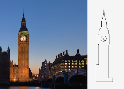
 Here I have done a more hand drawn image of big ben, this is a lot better than my first attempt as I have played around with the thickness of the pen tool, which has made it a lot better. This is still my style however with a bit more practise I think it will become a lot better looking and more professional.


I do think my last drawings is better just as its a bit more free and very much hand drawn looking, as I want to have this book as a journal of my time in Rome, I think the hand drawn style fits. As they look almost like sketches. When I'm in rome I want to take my own pictures so they the drawing will be more personal.

Here are the drawings in colour which has made my drawings look a lot better.


I have struggled with the drawings side of the project but the idea of doing drawings and photography has made me think a bit better about doing this project.

Here I have chosen to take an image of a sign in London to try out how the sign would look and I actually think this has worked well and I like this better than the drawing of the objects as it looks more interesting and could also be an almost map of where Iv been.


Here is the drawing with a background as I wanted to do this for all of my drawings as it finishes them off well. It makes the image look like it's not floating in mid air, if I choose to do photographs I don't think I would have a background as this would be unnecessary.


Rome

http://www.rome.info/

http://wikitravel.org/en/Rome

As I am going to Rome in a few days my new idea is to have a more focused plan when I go, I want to chose on area that I can take pictures of.


I would like to maybe focus on transport such as taxi's, or maybe sign's as we will be looking at them constantly. 


I think that maybe people could be interesting focus as London and Rome are main tourist site's that people go to. I don't know how I would be able to draw images from pictures however but this is something that I will figure out. 


Wednesday 23 October 2013

England

http://en.wikipedia.org/wiki/Great_Britain

I think I'm going to change the title to London vs Rome as this is more focused than England. In England we have so many different iconic places not just London we have the Lake District, Manchester, Newcastle these places are iconic as well and Rome section might not be as easy to compare to.

With this I can start to look more into the iconic things and people from London. I can start by using mood board's to get some inspiration and start to think and come up with a list of things I can compare to.

I'm going to keep this up to date as much as I can with the things I look at such as fashion and maps as these change frequently.

Fashion


I wanted to have a closer look at one of London's biggest days which is Fashion week where all the stars and important fashion designers get together to look at the new season's. It's such a big event each year and is what people work hard to get a good response from. 


I could focus on one part of fashion i.e shoes, part of clothing. Along with looking at the it supermodel of 2013. 


Cara Delevingne is properly the most famous model in 2013 just as described in Vogue she's the model of the year. She models for brands such as H&M, Burberry, Zara and Chanel. She has even walked in catwalk shows for Stella McCartney and Chanel, these all give her the crown to be number one british model. 

Maps

The most used map in London that is used is the Tube map.


This is the original tube map for the london underground, which was designed by Harry Beck. Harry Beck was originally an underground electrical draughtsman he designed a simple but creative design i 1933 which you can see above. He based his design on a more simple version of the circuit designs he drew for his job, but simpler for people to understand for the tube. This design has carried on all over the world being changed to fit other cities undergrounds but the look and the layout still looks like the one Harry Beck first designed. 


 This is the more up to date tube map for London. 


Sites 

When I think about my book I think that the sites are going to be the main focus as they are such a big symbol to each city. 

Here are some of the sites that make London what it is, I could try and do some of the illustrations a bit more detailed however my style is more simple and full of colour original. This is something that I need to decide for myself. 


Both the red letter box and phone box are symbol of London as well as the sites, in London they are all over the place. People get there picture taken with them if they are tourist's and you can get postcards with them on this just explains London. 


Tuesday 22 October 2013

The Ideas

My idea for this project came from my last self authorship project where I looked at Vahram Muratyan, who created the book Paris vs New York. He was my inspiration to started drawing again even if it is using a laptop, I was able to create beautiful simply drawings that have helped me develop my style. 


As this book has become the start of my inspiration for my work and ideas I wanted to carry on the theme. In the next month I will be going to Rome which is one of the most historic, romantic and busy city's in the world with the amazing opportunity to go I wanted to do an almost journal of the things iv seen. I went on to think I could compare England to Rome in a similar way to Vahram Muratyan, when he lived in Paris and Rome. 

I want to compare the everyday things such as bread, cars, roads, road signs etc as this is what we see everyday. I also want to compare historic buildings such the coliseum and big ben. I want this to be a fun project where I can keep something that is a diary of the time in Rome.   

Rome


England


For some inspiration I have been collecting images that represent Rome and England. This is a sort of starting point for this project, as it helps me think of what is different.

For some inspiration I could look into:


  • Food
  • Buildings
  • Inspirational people like the queen, singers, writers
  • Animals like type of dogs seen
  • Sign's
  • Drinks 
  • On the map
  • Typography
When I go to Rome this will make it a bit easier to collect images of my own however images from the internet and books will help me till then. 

English food:


Roman food:


These are the kinds of things I would like in my book as they define each country.  


As I have been to London  a few times when I have been there I have taken a lot of images to keep of my time there which many of us do, I could use my own images for London as well as Rome, I could even draw myself if I am in the images.

New Idea

After giving this some more thought I think that I need to pick an area in both cities that I can focus on, simply because I have found it hard to focus on a wide range of differences. I want to focus one thing in particular such as taxi's or drinking glasses etc. 
  • Road signs 
  • Food 
  • Other transports
  • People 
I think this will make a more interesting book if its more focused and it just means that when I go to Rome I can take photos and maybe have them included in the book. 

As I think that I'm struggling to draw images i think having a mixture might be good and a good comparison. 

A major part of this is that I don't want to miss out on anything when I'm there so I think a more focused idea is good.