Friday 22 November 2013

Journal on Rome

After being to Rome and experiencing the city myself I came back feeling like the project so far wasn't going as well as I thought as found it hard to concentrate on the idea of comparing London to Rome. So when I returned I felt that I could do more with this project and have a more focused journal on just Rome. This I find more interesting and the fact that I fell in love with the city will make this project more for me.

The Robinson Family on our Roman Holiday! (At the Colosseum)


As I was the person taking all the photos in Rome, I was able to take photos not only for my project at the time. Which was an advantage as I was able to take photos that weren't just of signs, I was able to take photos that were around me. This ultimately changed my idea after looking at the images once again to making my book on simply Rome.

My first ideas were to have the images in black and white but change around with the settings to make certain objects stand out to i.e. the colosseum. 


Like here I changed the background to black so the building would stand out. 


These two images I used the blue tint to see how they would look. However I do think that these images could be better used in my journal.

As well as images I would like to have a few words or a couple of sentences to show how I felt or maybe a quote or a bit of history to with the images to give the book more of a meaning then just a book of images.

Coming Back


After some time away from the project and coming back to it, I have felt that I can make a few more changes or improvements to the design.

I left the design in a place that I was happy with especially with how I have changed the images and made them look brighter/ darker along with making them look interesting on the page. The layout of my book is one of the key things that I have found hard with as I wanted images to flow but I also wanted the images to capture what I saw as well.
Another area that I am planning on chaining and improving is the typography in the book as I felt that over the months I have improved my skill on choosing the right typefaces for my work.

As Rome was my first experience hopefully not the last I would like to create a book that I can look back at and be proud of.


Monday 11 November 2013

Artist

As well as looking at Vahram Muratyan, I wanted to look at some other illustrators iv always been interested and catch up on the website Illustrator artists http://www.illustrationweb.com/, I just love to look at the latest artists.


I saw this artist Jennifer Maravillies who uses block colour which create images like above when you see them from afar. Her illustrations are completely different from that of Vahram Muratyan however the images I have chosen she has done are of cities which is interesting I could look into different ways to draw my images maybe?!

http://www.illustrationweb.com/artists/JenniferMaravillas/view


Illustrations

This is my style of drawing for this project I like how simple the drawings are however I am wanting to develop my style so maybe making the illustrations a bit more complicated could work? This will of course be coloured in to help represent the letter box but this something that will take time.


I am still developing my skills in drawing, if I am going to draw buildings which are a lot complicated than people or objects such as the red letter box like above. I think I need to make the drawings a lot simpler than my attempt above maybe play around with blocks of colour?


Something like this maybe I think it will look better having a bit more detail just to define the building a little bit more however I think this looks better than my last attempt. However the other problem I have is that I might not be able to draw images that look hand drawn which I am used to drawing and is ultimately the style I like. 


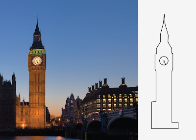
 Here I have done a more hand drawn image of big ben, this is a lot better than my first attempt as I have played around with the thickness of the pen tool, which has made it a lot better. This is still my style however with a bit more practise I think it will become a lot better looking and more professional.


I do think my last drawings is better just as its a bit more free and very much hand drawn looking, as I want to have this book as a journal of my time in Rome, I think the hand drawn style fits. As they look almost like sketches. When I'm in rome I want to take my own pictures so they the drawing will be more personal.

Here are the drawings in colour which has made my drawings look a lot better.


I have struggled with the drawings side of the project but the idea of doing drawings and photography has made me think a bit better about doing this project.

Here I have chosen to take an image of a sign in London to try out how the sign would look and I actually think this has worked well and I like this better than the drawing of the objects as it looks more interesting and could also be an almost map of where Iv been.


Here is the drawing with a background as I wanted to do this for all of my drawings as it finishes them off well. It makes the image look like it's not floating in mid air, if I choose to do photographs I don't think I would have a background as this would be unnecessary.


Rome

http://www.rome.info/

http://wikitravel.org/en/Rome

As I am going to Rome in a few days my new idea is to have a more focused plan when I go, I want to chose on area that I can take pictures of.


I would like to maybe focus on transport such as taxi's, or maybe sign's as we will be looking at them constantly. 


I think that maybe people could be interesting focus as London and Rome are main tourist site's that people go to. I don't know how I would be able to draw images from pictures however but this is something that I will figure out.